
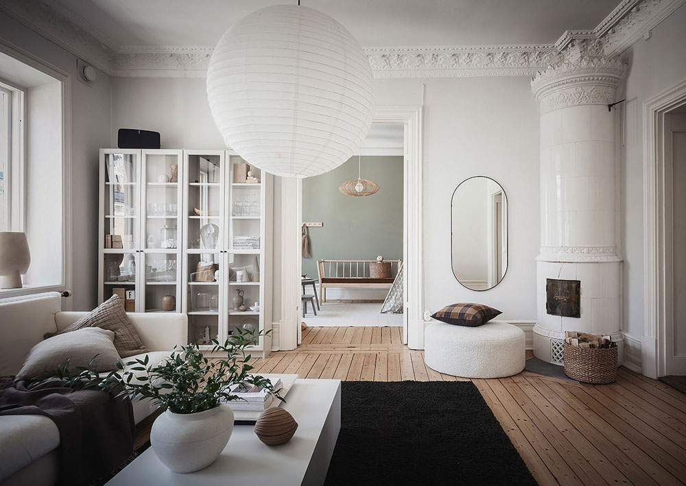
The words “earthy palette” and “natural colors” have been used countless times on Nordic Design to describe interiors featured on the website.
These homes are located in Scandinavia where ‘bringing the outdoors in’ goes beyond introducing fresh cuttings from the garden or a budding branch in a vase into your décor – Nature is, most often then not, at the center of design schemes. An array of white, beige, brown, black and the now popular olive tone, make for a gorgeous, warm and soothing palette inspired by Mother Nature that is widely used.
Here, I am showing you six interiors that all feature (pretty much) the same color palette – The main difference is the proportion allocated to each hue. I wanted you to see how you can easily change your decor just by swapping blond wood for walnut, for instance, or by bringing more -or less- of the same color. Below I am sharing a few tips for choosing your colors but first, let’s take a look at these:


It was important for me to show you that Scandinavian interiors are not always all white, but what they do have in common is their nature-inspired colors.
Try this:
Defining a palette helps you limit the number of colors you can “play” with, and that’s a good thing because it provides you with clearer boundaries so you can make easier/better/more focused choices when decorating. Your colors are your starting point to create a cohesive look that flows from one room to another.
I invite you to think of colors you love and that you want in your home. Then, take a look at your current home and identify the colors you have to work with and can hardly change such as floors, cabinets, etc. Just like when mixing wood, you need to identify the undertones of these colors (see my previous Insiders article ‘How to mix wood like a pro‘) to avoid mistakes. Of course, it is not to say you cannot mix cool and warm undertones, but it is an effective and easy strategy to get it right.
Usually, a good palette includes:
- One or two main colors, used in greater proportion;
- A saturated color for contrast
- An accent color
- An additional color, often a softer, muted version of one of the others in your palette.
You can go to your local hardware- or paint store to get a few color charts, cut out what you like, and create your palette. Keep it handy when you go shopping for your home or as a reminder/safeguard when introducing new elements into your décor.
Have fun and experiment in your home by adding elements in one color from your palette. Try removing all black decorative accents in a room for a few days, for instance, and see how it transforms the look. Flowers are a cheap way to test out a new hue in your color scheme before you splurge on new accessories.
Coming up soon: I am working on a short lecture all about colors! If you have specific questions or are excited about this topic and would like to let me know, send me an email!
Photo: