
This beer brand concept is actually a school project at the Icelandic Academy of Arts. Students were asked to make a brand for a micro-brewery, as part of the course ‘From Idea to Market’. It is not in production yet, but the concept is available for purchase.
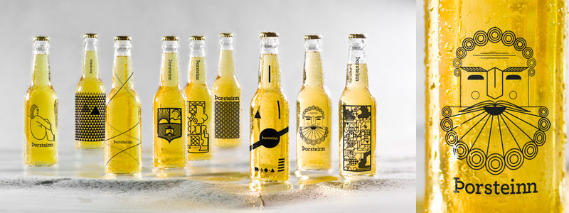
The concept is to have one beer, 10 different bottle designed by 10 different designers. The design would be changed annually and could be put on beer glasses as well.
“We decided on making versatile design but limit it down to a single color graphics. Our approach was different, but we all shared the same ideology about breaking out of the ordinary and making graphics that aren’t exactly typical for beer bottle labeling. The concept also makes the brand a platform for other graphic designers to show off their own design for design’s sake.” –Source
Photos: Hörður Ellert Ólafsson via behance.net


“Loosely translated”?! You mean wrongly translated. The name Thorsteinn is made of two words, Thor, the nordic god and steinn (stone). Has nothing to do with thirst, whatsoever…Bad promoting for a good design.
Author
Hi Eva,
Thanks for your message! It is important for us to share accurate information on Nordic Desig. We always double (triple!) check with various credible sources. It is indeed unfortunate that the info about this project published on the web is misleading. We’ll remove it from the article.
You got to admit it would have been a nice brand name concept though! :-)
Catherine
Hi Eva
I’m one of the designers and I can explain the name a little better. It’s true that the name is assembled by those two words, Thor and Steinn (stone), but the name Þorsteinn includes some wordplay that makes sense for Icelanders. The word “thirst” is “Þorsti” in Icelandic and the number “one” is “einn” in Icelandic. Hence the loose translation into “thirsty one”…